Frolick Fitness
Branding


Naming +
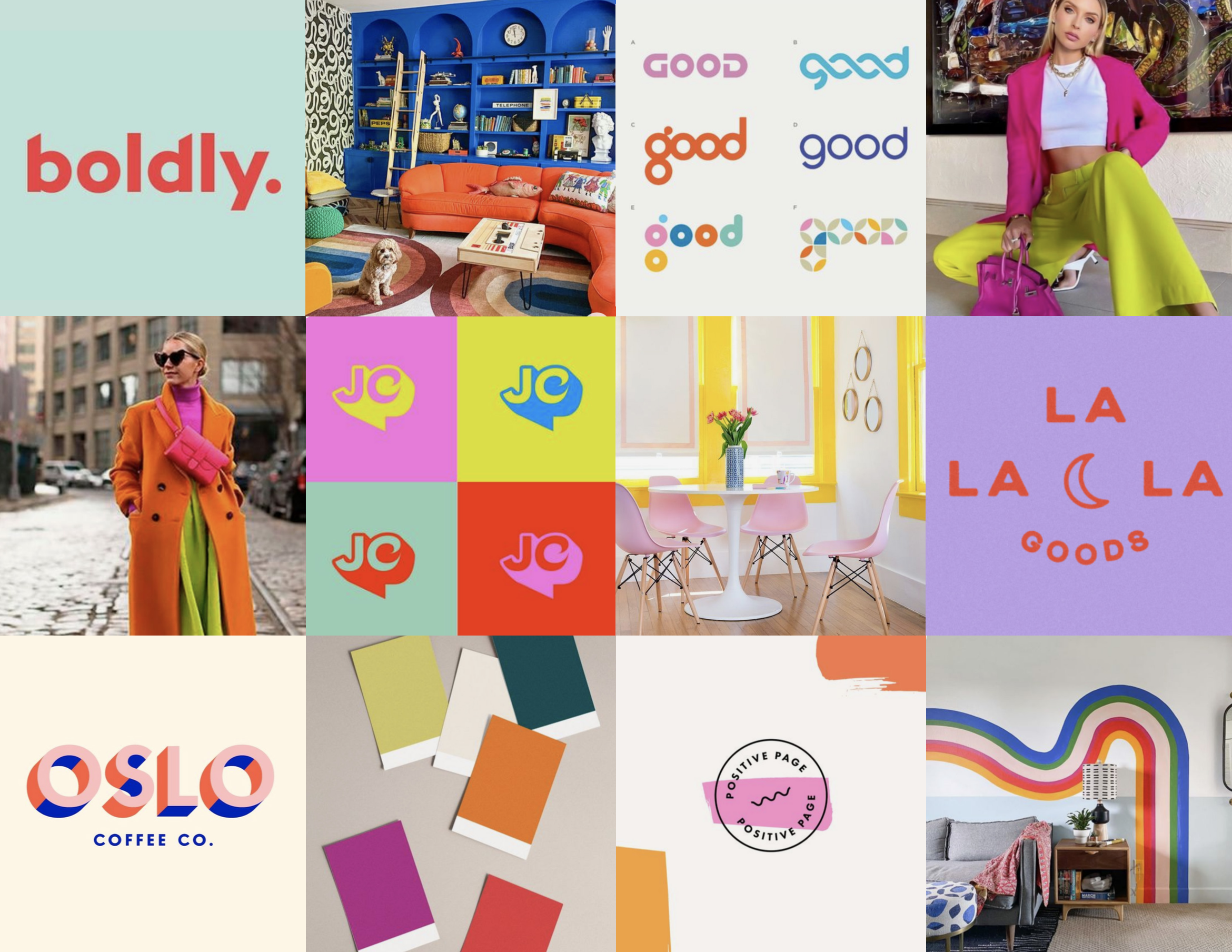
Moodboards
Jen was looking to re-name and re-brand her business. After talking with her, I knew it needed to be something as energetic as she is. We landed on Frolick with a bright and FUN color palette.


Logo Design
Frolick is not your average fitness brand, so I aimed to defy convention and infuse it with a youthful, funky spirit that reflects Jen's unique personality. Both the primary logo and the secondary logo (below), create a visual identity that resonates with her audience and celebrates her distinctiveness.
Mark
In crafting the mark, I aimed to embody inclusivity and joy through a gender-neutral figure engaged in playful frolicking. This whimsical representation not only embodies the brand's commitment to inclusivity but also evokes a feeling of carefree delight, inviting individuals from all walks of life to engage with the brand's offerings.


Business Card
For the business card, I embraced the vibrant and playful design. The result is a business card that not only serves as a practical tool for networking but also leaves a lasting impression, reflecting the client's dynamic personality.


Merch
I curated designs for merchandise that marry functionality with the brand's ethos. Whether it's the cozy warmth of the beanies, the wearable fun of t-shirts, or the playful versatility of the stickers, each item serves as a tangible expression of the brand's values.


Brand Guide
This brand guide serves as a roadmap for maintaining consistency and coherence across all brand assets and communications. By providing clear instructions and examples, it empowers the client to effectively convey their brand identity with confidence and clarity.

