Donna Bella Hair
Direction + Design
Secondary Logo & Mark

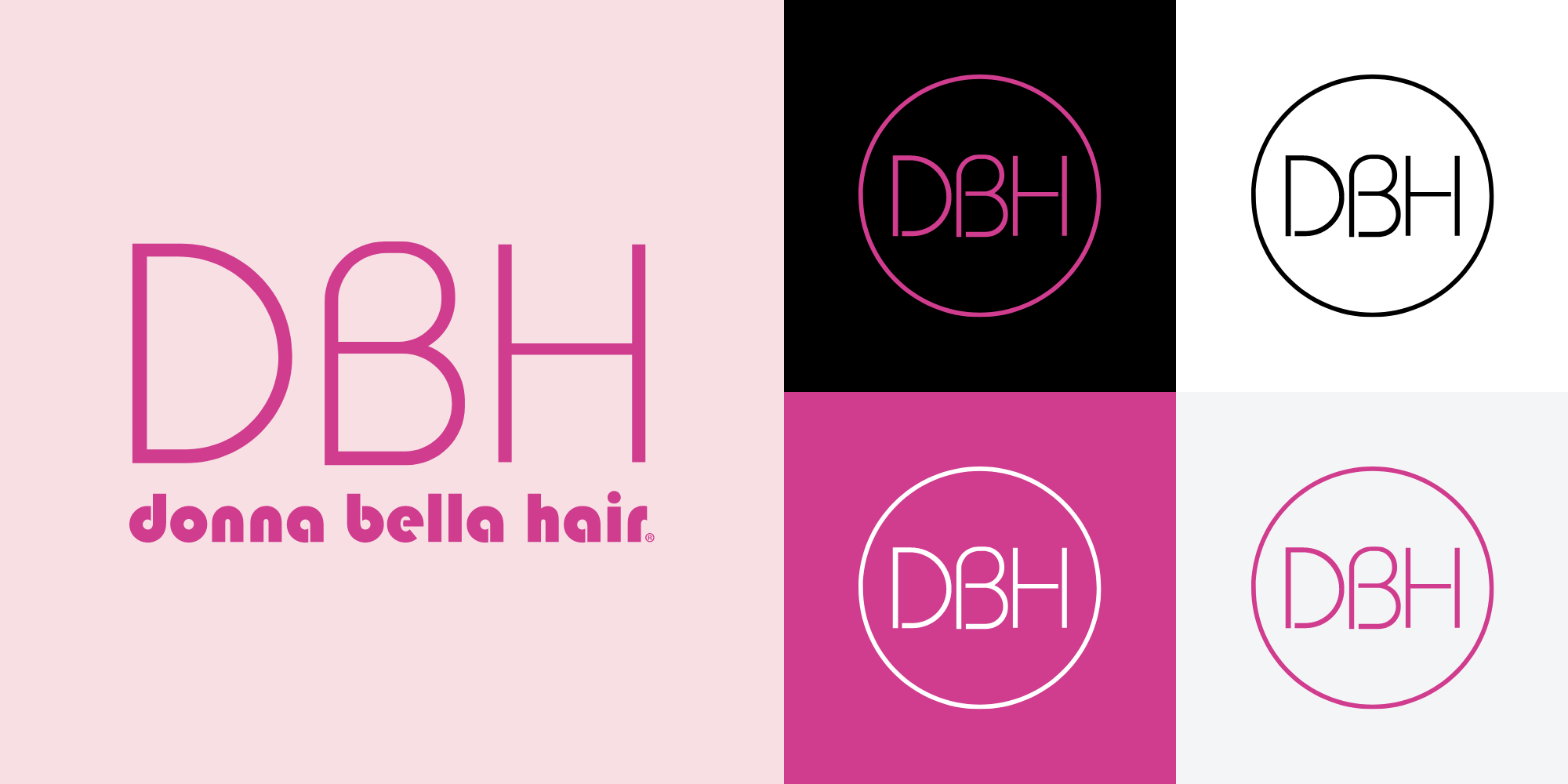
Donna Bella Hair had been using the same mark for years - but decided they wanted something fresh in 2021. They kept their primary logo (the “donna bella hair” portion), so they needed a solution that could work with both the logo and be able to stand on its own. This new mark can be seen on social media, packaging, and more.

Photo Shoot Direction
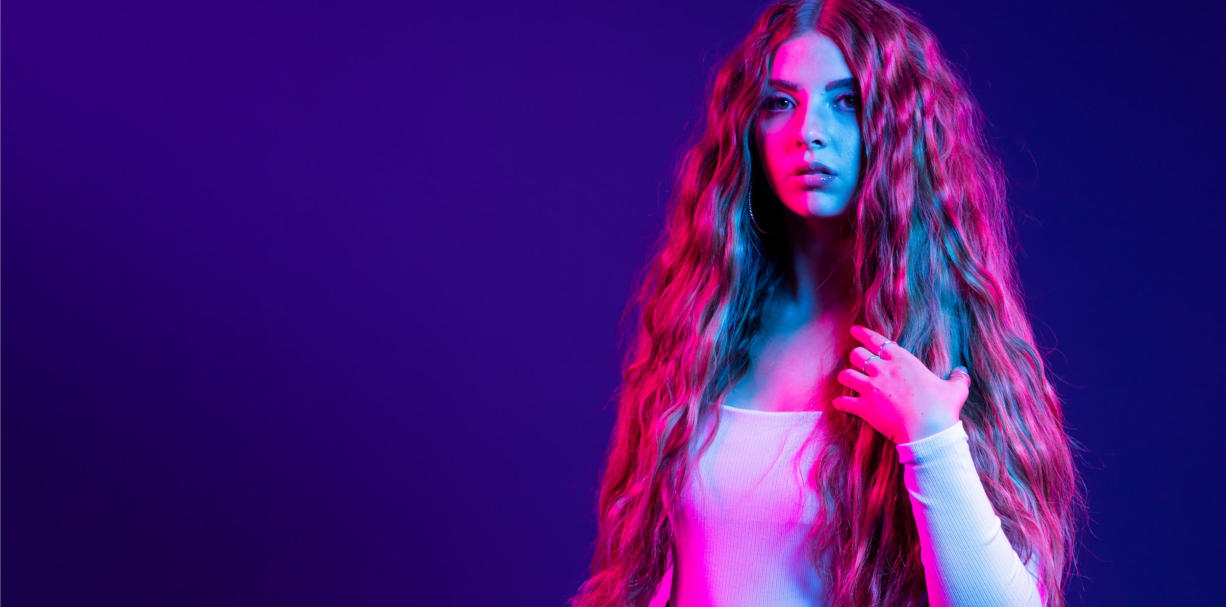
In the past, DBH would use simple studio photography for their campaigns. Together, we were able to conceptualize and art direct a new approach to photoshoots. This example is from one of their Black Friday / Cyber Monday events, where we featured all neon-lit models.
Campaign Planning

Every campaign was well thought-out ahead of time with concept decks. I provided inspiration, ideas, direction, and more. This was used to kick off the project and serve as an example to all people involved.

Brand Guide

Prior to 2021, a brand guide for Donna Bella Hair did not exist. I compiled all information into one place for everyone in the company to reference. This included logo/font/color dos and donts, customer information, product details, and more.
Packaging


In 2022, DBH was picked up by Sally Beauty in stores and online. I created the packaging for their Premium Clip-In Extensions, following specific requirements from both companies.
Email Campaigns


We collaborated on countless campaigns together – each having anywhere from 3-12 emails. This is a sample of some of those campaigns.


Paid Ad Campaigns


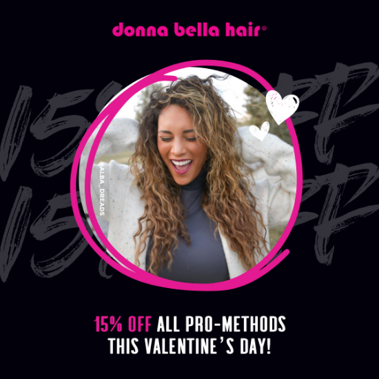
DBH utilizes paid ads for specific campaigns (i.e. Black Friday or DBH First Membership), but also for evergreen content to runs continuously on social media. Over the years I’ve created both kinds of paid media (static + GIF) for them with great results.


Organic Social


Every DBH campaign has organic social media assets – but we’d also produce 10-15 story sets per month to engage with the online community.

Web
Together we worked on updating the homepage to make it more customer-friendly, as well as introducing a brand new page: the Compare page. I noticed there was nowhere for new customers to see an overview of styles, so this was my solution - it quickly became the most viewed page on the site.
