Beverly Hills
Audit + Strategy + Editing + Direction + Design
Audit
Beverly Hills has been in the skincare industry for a while, but was looking for a refresh. We went through all existing products, messaging, website/Amazon, etc. to discuss what was working and what wasn’t. Next, I created a plan with actionable steps to take their brand to the next level.
Logo Update

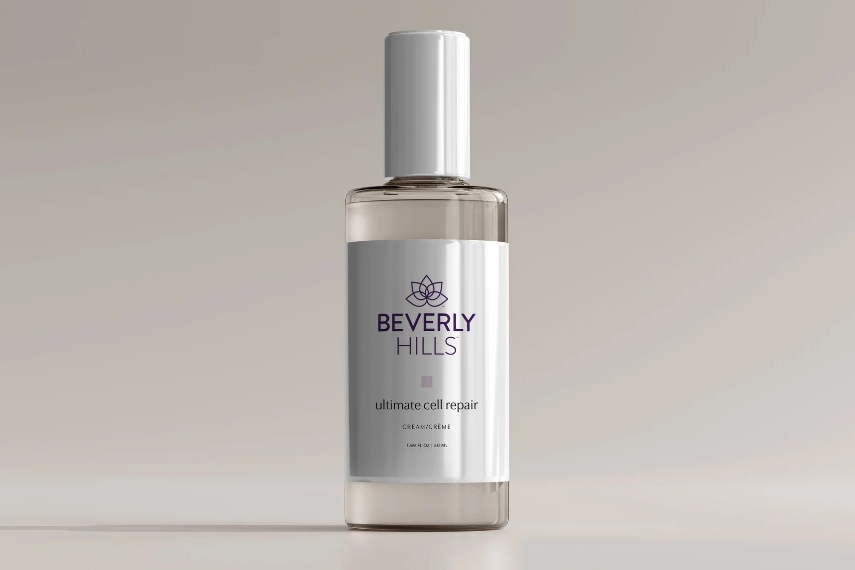
To begin, I slightly updated the logo. I re-drew the lotus, moved it to the left, and made it larger to be more of a focal point. Then I used a softer font for the brand name.


Messaging
Next, we moved on to messaging. I organized their 35 products into 6 collections that focus on different areas of skincare (i.e. rejuvenation, moisturizing, etc.) Then created a structure for content (tagline, benefits, key ingredients, etc.) for every product We worked with a copywriter to write everything, which then I and the client went through and edited and finalized. The result was much clearer, concise information for customers.


Packaging
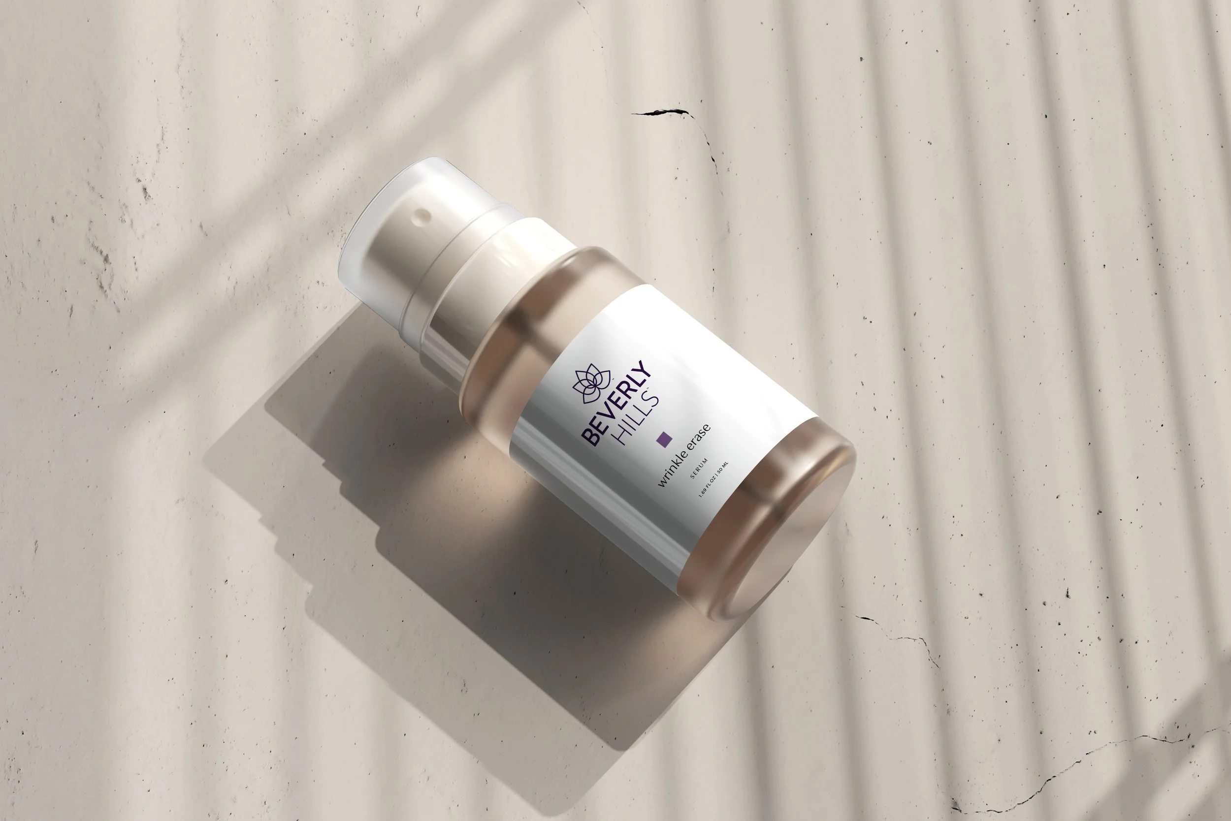
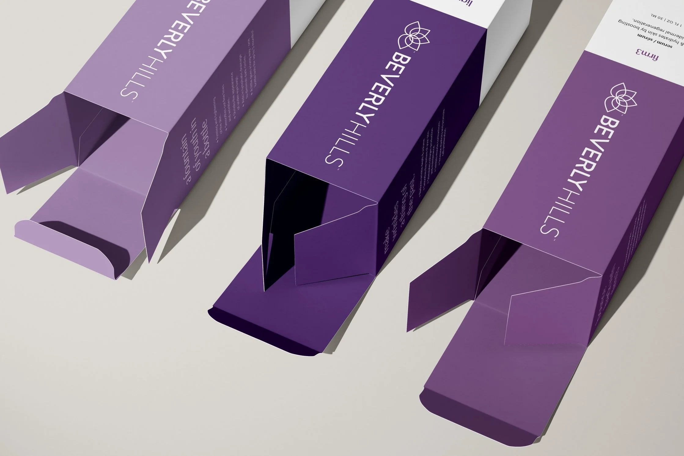
We then rebranded the packaging to be more elegant. The box colors represent each collection, which corresponds to the colored square on the bottle. Each box features key benefits and instructions, while the product itself stay more simplistic.


Brand Guide
Finally, I complied all product information, design elements, photo direction, etc., into a 71 page brand guide. This will easily guide anyone in the future on how to create work for Beverly Hills.
